Hands-On With the Android N Developer Beta: Multi-Window & More
by Brandon Chester on March 10, 2016 8:00 AM EST- Posted in
- Smartphones
- Android
- Mobile
- Tablets

Yesterday Google surprised a number of people by launching the developer beta of the next release of Android, which is codenamed Android N. Normally the beta version of Android comes to developers during Google I/O in May, but in a way it makes sense for Google to release it to developers a few months earlier so they can receive feedback and discuss common questions and concerns during the event.
The early release isn't the only change with this new beta version of Android. In the past I've often complained about Google's poor handling of developer betas. They've always been too monolithic for my liking, with only two or three betas being released to developers before the final version. There was also the problem with installation. While I am not averse to using the Unix shell, there is no reason that a developer should have to use adb via the command line to install a developer beta of Android. It should be done via an update directly from the device, or by some software tool with a proper graphical interface that can be run on your computer. It didn't help that the update packages often failed to work which required you to decompress it and flash each file one by one.
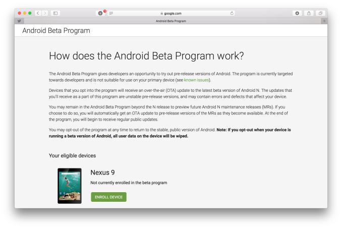
With Android N, Google has recognized and resolved these problems by providing a simple way for developers to opt in to the program via a web interface. Once you opt in, your device almost instantly receives a notification prompting you to install an over the air (OTA) update which will install the Android N beta. This is much more user friendly, and it has the added bonus of making it easier for users to opt in which gives Google more usage and diagnostic data to work with. Because the OTA isn't just making changes to the existing OS it is quite large, with it being just under 1GB on the Pixel C and Nexus 6, and 1.1GB on the Nexus 5X.
In this article I'll just be taking a look at some of the most notable features of Android N, including Multi-Window mode, changes to notifications, and improvements to energy and memory optimizations.


124 Comments
View All Comments
arsjum - Thursday, March 10, 2016 - link
"Though I suspect it's not a popular opinion, I have long felt that the software design ecosystem for Android tablets has been stuck in a rut since the early days, and as a result users have struggled to find good, modern applications that really excel at the tablet experience."I suspect that's actually a very popular opinion and justifiably so. :)
ImSpartacus - Thursday, March 10, 2016 - link
Yeah, no one like android tablets.People can tolerate oversized phone-like devices like the Nexus 7, but not legitimate tablets.
nathanddrews - Thursday, March 10, 2016 - link
Personally, I can't tolerate anything but a x86 Windows tablet. I feel much more comfortable knowing that I can do anything and everything that I need to do from work or play without being trapped by a walled garden. If I have to, I can emulate Android with BlueStacks (like I did to play games like Fallout Shelter) and the experience is so much smoother and better than any other native Android device that I have used.ddriver - Thursday, March 10, 2016 - link
Cuz nothing beats the user experience of a classical windows desktop application on a high resolution small screen tablet :)nathanddrews - Thursday, March 10, 2016 - link
I really like the 1280x800/1366x768 10" format that most budget tablets use. My preference is 1080p in a 12-13" as it strikes a great balance, but I'm not willing to spend that kind of money for something that I throw around and abuse like I do. Even my large fingers can type quickly and close browser tabs with ease. It's a much better experience to me than iOS/Android.darkich - Thursday, March 10, 2016 - link
For $250 you can buy a 2K 10" Android tablet that will, as a matter of fact, provide you with a vastly better screen for video, reading, gaming(touch-oprimised games, you know) and browsing.But yeah, go enjoy your "superior tablet experience" with a 1280x800 screen.
lexluthermiester - Thursday, March 10, 2016 - link
There is nothing wrong with 1280x800 screens. An 8" or 7" IPS screen at that resolution works very well. But I have a 12" Dell with that res screen that looks just fine. A 10" 2k screen is very nice looking, sure, but the GPU has to work harder to push that many pixels which drains that battery. So all in all that a good resolution. Don't be so spoiled.djayjp - Thursday, March 10, 2016 - link
I guarantee you that once you have a truly pixel indistinguishable screen device, you'll never look at those low res devices the same again. You'll find it rather hideous (assuming you do not require reading glasses).metayoshi - Saturday, March 12, 2016 - link
Why don't you get a Surface 3 or wait for a Surface 4 (non-pro) if/when it comes out? I'm in the same boat as you: my preference for tablets is a Windows x86 tablet, like the Surface 3 I'm using to type this comment. I used to have the Acer Iconia W4, which was 1200x800 and admittedly a pretty decent Windows tablet at the time, but the 1920x1280 Surface 3 is a vastly superior experience. The Microsoft built keyboard cover also makes a great addition, as it makes typing for longer bouts much better, but if you don't need to type too much, detaching the keyboard and stowing it away is easy. With the Acer and other 3rd party Windows tablets, you'd need a separate Bluetooth keyboard, which I also had for a time, but it wasn't as convenient as the Microsoft type cover. Some OEMs also provide their own keyboards, but I still feel like none have matched the quality of the keyboard from Microsoft. The full sized USB 3.0 port is also a godsend, as you don't need a micro USB to USB-A connector and you can just plug in anything and everything that already works in normal Windows. It's just much better and worth the little bit of extra money over the really low end budget Windows tablets. Not quite Surface Pro level, but a great middle ground between too cheap and high end.Lolimaster - Thursday, March 10, 2016 - link
Sorry but 16:9 is pure sh*t aside from media consumption. 16:10 or even better 3:2 all the way.