Google's News & Weather App Updated to Version 2.0
by Brandon Chester on August 26, 2014 2:30 PM EST- Posted in
- Smartphones
- Mobile
- Tablets
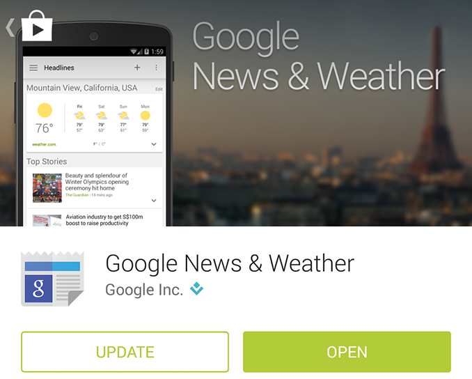
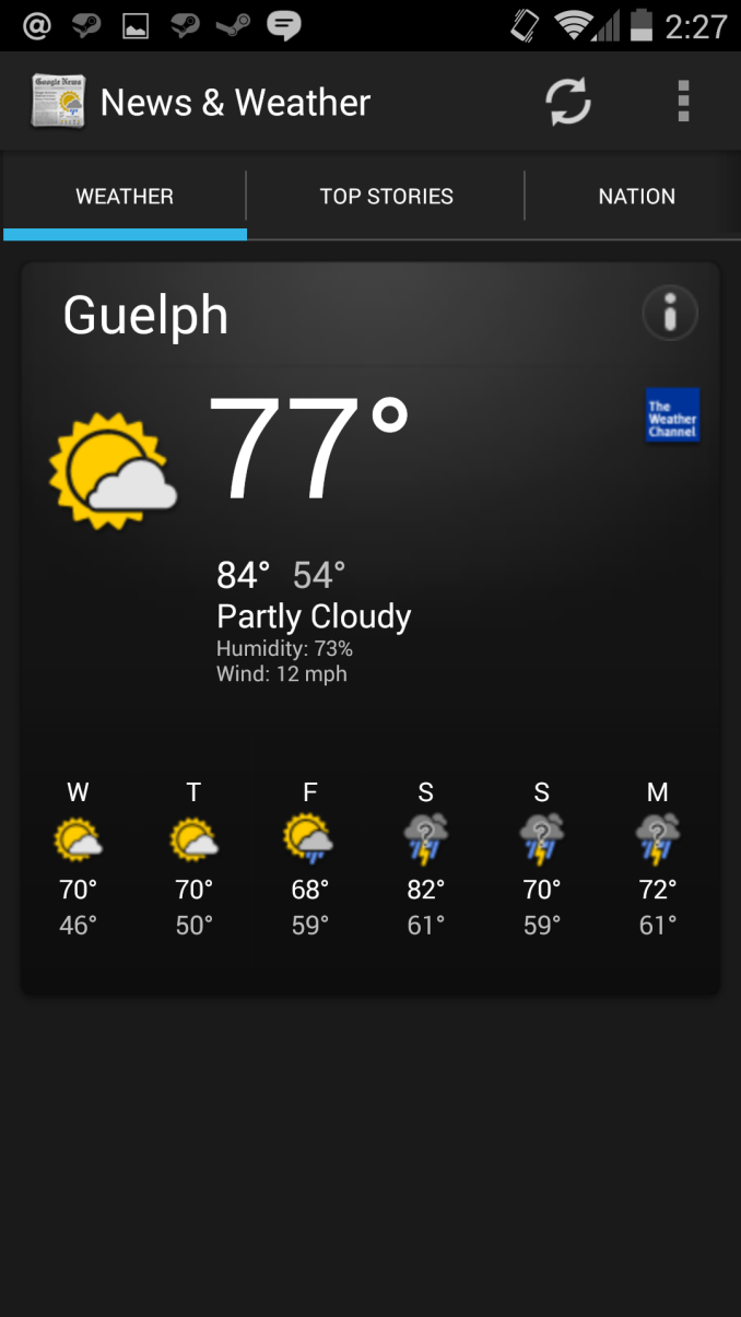
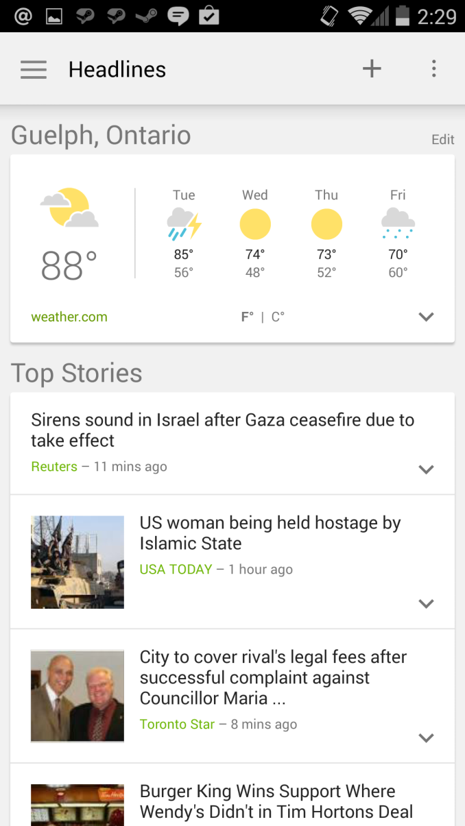
Today Google has rolled out an unexpected update to an app that seemed long forgotten. It's the News & Weather application that comes on Android phones running software maintained by Google like Nexus and Google Play Edition devices. The big change with the update is a complete design overhaul that implements Google's Material Design principles. The app previously sported a design that was like a relic from the distant past, with an interface that seemed like a mixture between Android Gingerbread design and some parts of Google's original Holo design from Android Ice Cream Sandwich. There was heavy use of black, with horizontal scrolling sections and gradients throughout.
Old News & Weather on the left, new on the right.
The new design is like a breath of fresh air. I had not even used the old app to change the temperature units from Fahrenheit to Centigrade because the design was so outdated that I looked to other apps to get weather and news information. The weather images had also not been updated to support very high resolution devices in the 400+ ppi range, and looked quite blurry. The new design does away with the black color scheme and features information displayed on white cards with high resolution weather images. The tabs at the top have also been removed, and all weather and news information is displayed in a single vertically scrolling list. Specific news topics can be accessed by the navigation pane that slides in from the left. Information about temperature and precipitation trends can be revealed by tapping the downward arrow on the weather card.
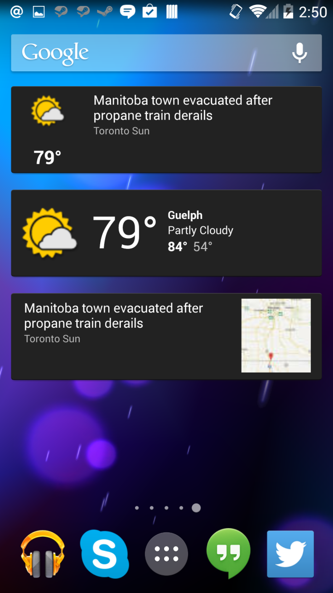
Old News & Weather widgets on the left, new on the right.
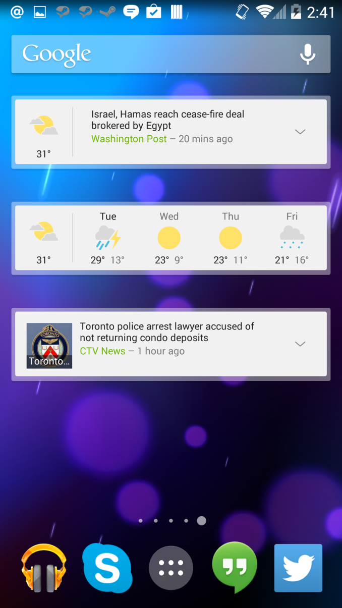
The widgets for the app also receive a makeover. The app maintains the options for news + weather, news only, and weather only, with the weather only widget being changed to display the forcast for the coming days rather than just the current weather. The widgets also have a semi-transparent border around them, which may be another element in Google's new design language.
News & Weather 2.0 is out on Google Play now. Like all of Google's updates, it may take some time before your device receives it.
Source: Google Play




23 Comments
View All Comments
Yofa - Tuesday, August 26, 2014 - link
shout out to manitoba!jeffkibuule - Tuesday, August 26, 2014 - link
The old app looked like someone had beaten it with an ugly stick. A relic of a bygone era.pixelstuff - Tuesday, August 26, 2014 - link
I haven't downloaded it yet. Did they get rid of the temperature / rain graph? That was my favorite part of the old app.Brandon Chester - Tuesday, August 26, 2014 - link
No no. You can view it by pressing the downward arrow on the forecast cardWitchunter - Tuesday, August 26, 2014 - link
I actually like the old one more. Much more easier on the eyes.Flunk - Tuesday, August 26, 2014 - link
Funny, I thought Google had discontinued this app because they rolled all the functionality up into Google Now.lilmoe - Tuesday, August 26, 2014 - link
That's a thing with Google's designs as of late. The contrast in design elements (color) isn't nearly as it should be. They're always assuming everyone has 100% sRGB screens, or they're just taking it too far. I've always had a hard time with their Calendar app, one of the reasons I always stick with SPlanner (that, and because it has much more features)...Lately, they've been over exaggerating simplicity at the expense of practicality and features. *Some* of their newer apps aren't nearly as useful as they used to be.
toyotabedzrock - Wednesday, August 27, 2014 - link
Google now is odd looking and my Nexus 5 has this app but it is not listed as an installed app for some reason.uhuznaa - Tuesday, August 26, 2014 - link
Wouldn't it be great if Google Reader would still exist and deliver your news?And yes, what about Google Now?
Trying to make sense out of what Google does sometimes feels like wrestling jelly.
A News and Weather app could complete Google Now nicely if it were more of a "Google Here" app, delivering mainly local news, maybe integrating somewhat with Google+. Google Now is basically all about the user and his data and such a local news and weather app should be about "everything else around me here". Maybe revive something like Latitude in it, so you get an alert (as "local news") when someone is near you.
But another app that displays the weather and general "curated" news? I would expect Google to come up with something better here.
soccerballtux - Tuesday, August 26, 2014 - link
old one made better use of vertical real estate. I don't know what the deal is with everyone going "hey we have larger screens, let's add a bunch of filler space"-- Windows 7 File explorer status bar on the bottom, etc